At art school, we had a project called “30×30”: we took the largest sheet of paper we could find, divided it into 30 squares, and created an illustration in each one. The goal was to use a different media or approach each time, to explore various methods and not get stuck in a style too early.
I revisit this exercise every so often when I need direction, but keep to a manageable number. For this illustration, I sketched an artist cat character and traced him onto postcard size watercolour paper.

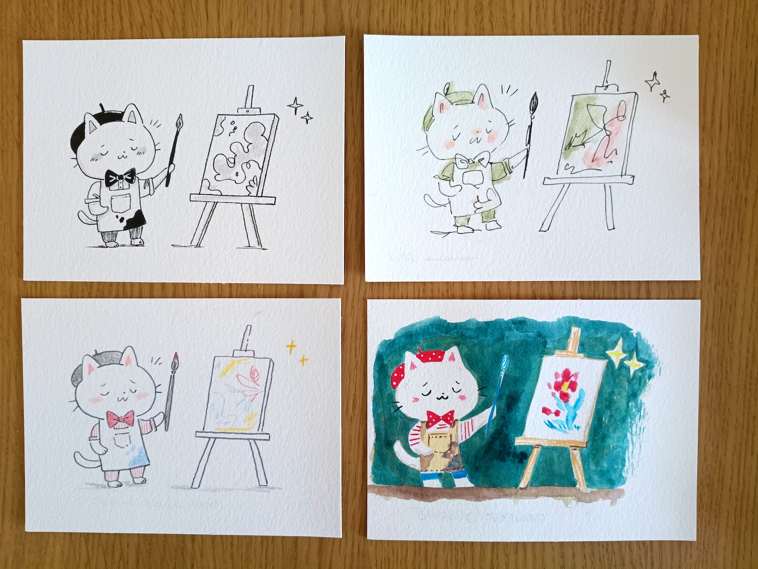
When doing this challenge, try to stay present and think about what you are enjoying creating, not just which result you like the look of at the end. Think also about what matches your personality and what the different approaches could be used for. In the example above, the top left would work well for children’s novels, while the bottom right could work for attention-grabbing advertising.

I’m happier with this second set, and hopefully they show the range you can achieve with the same tools and sketch; the black and white one this time is more carefully drawn with attention on line weight, while the ink and watercolour has more spontaneity than the previous one. The top left drawing would be great for books or blogposts. The messy watercolour one was fun to do but not instantly readable, so I’m not sure what it could be used for. The bottom left one is a style I often use in my journal since it has a calm and thoughtful vibe, while the bottom right painting is my current go-to style for finished works.

Finally, I made a couple of digital variations. I’ve wanted to try out a simple line and mono-colour style for a while (left) which could also work for books; the right-hand one is how I usually draw my custom map illustrations. Both are made with a stylus on iPad with Procreate. Digital work is great for editing with its undo tool, but I find more and more that there’s something limiting about drawing on glass, and it doesn’t feel as real as mixing up paint or drawing in pen.
I started this exercise thinking I’d find one correct answer to make illustrations, but I’ll admit I’m even more confused as to what direction to take. I think this is where the analytical brain needs to hold off from evaluating, and I’ll continue to experiment with the various methods I’ve come up with today. I predict that I’ll naturally lean more to certain styles, and others will merge together as I progress. It’s a nice set that I can share with others, and if a client prefers a certain look, I can create that for them.
If you’ve read this far, I’d love to know your thoughts on which ones you’d like to see more of. Thanks for reading!
Leave a Reply