Illustrating poetry offers readers another perspective on a poem. More than just decoration, illustrations can highlight symbolism and atmosphere, helping readers engage with it more deeply.
For this personal project, I chose William Wordsworth’s Lucy poems partly because they are in the public domain, giving me freedom to work with them, and partly because I wanted to challenge myself to create with something I previously dismissed as uninteresting. At first glance, the poems feel as though nothing happens, and the descriptions of nature felt sentimental and old-fashioned to me.
When I read the poems more carefully and thought about the connections between the five Lucy poems, I became more aware of their subtle emotions and atmosphere. The reflective, atmospheric tone and finding beauty and meaning in ordinary things are all elements I look for when painting, and they have a surreal, dreamlike quality and ambiguity to them.

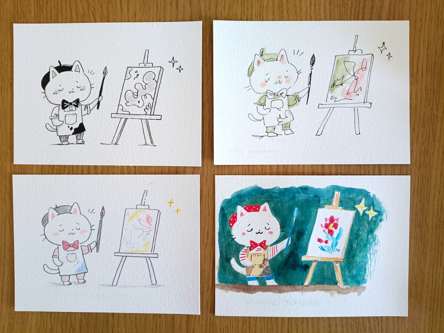
I focused on one poem at a time and read through it several times, making sketches and brainstorming ideas in my sketchbook. I just have one rule, that I’m not allowed to judge any of these first attempts. That way, I can get down as many ideas as possible without censoring myself. I chose not to draw the woman Wordsworth talks about directly, since the poems speak of her absence and suggest she has become part of nature instead. Some readers see Lucy as a symbolic figure instead of a literal person.

I used a muted palette inspired by traditional earthy colours to reflect the poem’s sadness. Her face is shown in the negative space next to the tree, and I used ivy to show that the tree will eventually die, too. However, since painting this I learned that trees and ivy coexist. Rather than weakening the idea, I think it adds to the sense that things are not always what they seem.

I chose something simpler with this poem, focusing on the flower and star. I think of it as taking place at dusk, and the star appears faintly before the darkness shows all the stars around it. People aren’t looking and it shines alone, unnoticed. I think Wordsworth is telling us that beauty is all around us, but we have to pay attention to see it.

This poem has a lot of dream logic and a surreal feeling to it. I pushed through the obvious ideas I had to try and get to something deeper. It talks about the poet rushing to reach his lover’s house before the moon descends, at which point she will already be dead. I get the feeling that his movements are tied to the moon, and the closer he gets to the cottage, the lower the moon falls. However, that proved difficult to capture in a static image.
I looked at surrealist artists and was inspired by René Magritte paintings, The Great Family and Arbre et lune. My illustration shows the rider and horse silhouetted as a starry sky against the sunset, showing the approach of night. The moon glows brightly, and floats in front of the landscape, unsettling the sense of reality.
The next poem is long, so I sketched out the space I had to work with and kept it simple. The cherry blossom symbolises a short but beautiful life. I took photographs of cherry blossom trees and studied various artists from the past, including woodblock and botanical illustrators, before creating my own experiments.

I used a cool-toned palette, for the flowers but changed my mind and tweaked it in Procreate to give it more warmth.

Finally, the last poem expresses the author’s previous desire for adventure and his realisation that he is happy to return home. I considered showing a harbour, but the boats risked dating the image and I wanted the series to feel timeless.

I was inspired by David Hockney’s landscape paintings, and tried a few different versions with aerial perspective. In the end, I kept it simple and peaceful, with gentle rather than dynamic action.

The gulls head inland, and the pink sunset is hopeful, as even though Lucy is dead, the poet is at peace.
I started the series with a rough plan that evolved with each painting. The colour palette developed naturally, and I repeated the themes of dreamlike atmosphere, surrealism and ambiguity.
Working on the Lucy poems changed my view of Wordsworth. The project reminded me that inspiration can appear in places we initially overlook.
Thanks for reading. Until next time,
Madeleine