When I walk in nature, or get absorbed in creativity, I enter a different kind of state.
I feel a release of tension, a sense of unwinding. It’s a kind of dreamlike state of awareness, as I forget the worries of life and tune in to the shapes, lines and colours around me.
I notice caterpillar cocoons, how the light falls on a hay-bale, the softness of the air. I walk quietly, in case I spot wildlife.
Sometimes, when I watch certain things – a crow landing on an unlit bonfire; cows drinking from a river; a gnarled oak tree – I feel I am witnessing something ancient and spiritual.
I do not think I am special. Anyone can build these powers of attention and dreamlike state if they wish to. It helps if you leave your phone at home, and limit your screen time more generally.
If you feel inspired, capture your observations in a pocket notebook. It’s ok if it drawn or written badly. A camera helps, if you don’t have a notebook with you. Or etch the shapes into your memory, if moving will disturb your subject, and get them down on paper as soon as you can.
Most importantly, you must take this walk alone. Other people will distract you, and it will feel like being pulled awake, if you manage to enter the dreamlike state at all.
When you get back to your desk, you will feel changed. You might have notes and drawings you can use right away, or it may take time for your subconscious to act on what you have seen.
Keep doing this, and your relationship with nature, and your art, will be changed.
Illustrating poetry offers readers another perspective on a poem. More than just decoration, illustrations can highlight symbolism and atmosphere, helping readers engage with it more deeply.
For this personal project, I chose William Wordsworth’s Lucy poems partly because they are in the public domain, giving me freedom to work with them, and partly because I wanted to challenge myself to create with something I previously dismissed as uninteresting. At first glance, the poems feel as though nothing happens, and the descriptions of nature felt sentimental and old-fashioned to me.
When I read the poems more carefully and thought about the connections between the five Lucy poems, I became more aware of their subtle emotions and atmosphere. The reflective, atmospheric tone and finding beauty and meaning in ordinary things are all elements I look for when painting, and they have a surreal, dreamlike quality and ambiguity to them.
I used ink and watercolour to capture thoughts and observations quickly and avoid overthinking.
I focused on one poem at a time and read through it several times, making sketches and brainstorming ideas in my sketchbook. I just have one rule, that I’m not allowed to judge any of these first attempts. That way, I can get down as many ideas as possible without censoring myself. I chose not to draw the woman Wordsworth talks about directly, since the poems speak of her absence and suggest she has become part of nature instead. Some readers see Lucy as a symbolic figure instead of a literal person.
A slumber did my spirit seal
I used a muted palette inspired by traditional earthy colours to reflect the poem’s sadness. Her face is shown in the negative space next to the tree, and I used ivy to show that the tree will eventually die, too. However, since painting this I learned that trees and ivy coexist. Rather than weakening the idea, I think it adds to the sense that things are not always what they seem.
She dwelt among the untrodden ways
I chose something simpler with this poem, focusing on the flower and star. I think of it as taking place at dusk, and the star appears faintly before the darkness shows all the stars around it. People aren’t looking and it shines alone, unnoticed. I think Wordsworth is telling us that beauty is all around us, but we have to pay attention to see it.
Strange fits of passion have I known
This poem has a lot of dream logic and a surreal feeling to it. I pushed through the obvious ideas I had to try and get to something deeper. It talks about the poet rushing to reach his lover’s house before the moon descends, at which point she will already be dead. I get the feeling that his movements are tied to the moon, and the closer he gets to the cottage, the lower the moon falls. However, that proved difficult to capture in a static image.
I looked at surrealist artists and was inspired by René Magritte paintings, The Great Family and Arbre et lune. My illustration shows the rider and horse silhouetted as a starry sky against the sunset, showing the approach of night. The moon glows brightly, and floats in front of the landscape, unsettling the sense of reality.
The next poem is long, so I sketched out the space I had to work with and kept it simple. The cherry blossom symbolises a short but beautiful life. I took photographs of cherry blossom trees and studied various artists from the past, including woodblock and botanical illustrators, before creating my own experiments.
Label any artist copies so you don’t accidentally use them! My final design is very different from the studies, at the bottom of the page.
I used a cool-toned palette, for the flowers but changed my mind and tweaked it in Procreate to give it more warmth.
Three years she grew in sun and shower
Finally, the last poem expresses the author’s previous desire for adventure and his realisation that he is happy to return home. I considered showing a harbour, but the boats risked dating the image and I wanted the series to feel timeless.
These postage stamp size drawings are called thumbnails, and are useful for exploring ideas quickly.
I was inspired by David Hockney’s landscape paintings, and tried a few different versions with aerial perspective. In the end, I kept it simple and peaceful, with gentle rather than dynamic action.
I travelled among unknown men
The gulls head inland, and the pink sunset is hopeful, as even though Lucy is dead, the poet is at peace.
I started the series with a rough plan that evolved with each painting. The colour palette developed naturally, and I repeated the themes of dreamlike atmosphere, surrealism and ambiguity.
Working on the Lucy poems changed my view of Wordsworth. The project reminded me that inspiration can appear in places we initially overlook.
Every week, I visit the library in my local town to reserve or borrow books. It’s free, and when I tie a visit in with a grocery shop, it feels like I’m stocking up on brain food as well. That probably sounds pretentious, right?
There’s a difference in feeling between buying books and borrowing them. With the first one, I’m slowly adding to a collection, choosing books that add to my life, even my identity. With the second one, I’m just looking for something to read right now, whether for entertainment, inspiration, or study.
Anyway, here are some books I’ve enjoyed lately, and you might, too:
Art Books
Keeping a Creative Sketchbook by Emma Block, Running Press 2024.
I liked Creative Sketchbook so much that after it was due back to the library, I bought my own copy. I loved Emma Block’s book on gouache techniques, and although I already keep a sketchbook, I wanted more ideas and insight on using it. The book goes into lots of activities you can try out to conquer the fear of the blank page, working with colour, and sketching on location. There’s examples from different illustrators, who all use sketchbooks in their own unique way. There’s nothing in this book that’s new or original, but the way it is written and organised is inspiring and friendly. It just makes you want to have a go for yourself. Since most of my ideas come out of my sketchbook, it makes sense to explore with it as much as possible.
Keys to Drawing by Bert Dodson, North Light Books 1990.
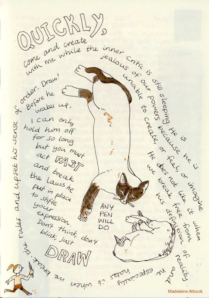
Keys to Drawing is old book that I have mixed feelings about. When I draw from life, the inner critic is quick to kick in, and I hear my university tutor over my shoulder, telling me how badly I’m drawing. Looking back, it was an odd teaching method, and I’ve no doubt exaggerated the criticism into a caricature. I think he actually said things like, “you’re not concentrating enough, this should take every ounce of your focus and feel difficult, the arm doesn’t go at that angle” and so on. My drawing at university worsened along with my confidence, and I lost the ability to draw gesture, agonising about every line instead. So, when I read a book about proportions, measuring, plumb lines, I’m transported back to drawing class and feel stifled.
Bert Dodson isn’t like that tutor. The book is written in a calm, easy manner, and I find myself thinking maybe I’ll give this kind of accurate drawing another go. What I like most about this book is the checklist at the end of each chapter. He uses a zen-like approach to drawing that anchors you in the present, and you answer questions such as “did I measure at least twice” and “did I restate this line”. If you tick “yes” to all the questions, you’ve passed, and it’s evidence that you’re learning skills, even if you found the drawing difficult and don’t like the result. He also gives permission to stop if you’re not feeling it.
I’ve had this on long-term loan for a few months(!) and making slow progress. Luckily, no one else has requested the book, but I might buy the ebook version and finally give it back to the library. Even people like me, that draw in a cartoonish and unrealistic style can benefit from this book, as it teaches you to really see, and I find myself using techniques from the book in unexpected ways. For example, after studying values (lights and darks) in photographs, I started designing illustrations that made better use of contrast.
See What You’re Missing: 31 Ways Artists Notice the World – and How You Can Too by Will Gompertz, Penguin 2023
I reserved See What You’re Missing thinking it would be a tutorial on looking at the world differently, but it turns out it’s an art history book. Each chapter looks at a different artist and what they contributed to the art world. I’m about two thirds of the way through, and so far, it’s really interesting. Artists I didn’t appreciate before, like David Hockney and Constable, are explained in an accessible manner (Hockney notices colours where others see grey, and Constable focused on clouds when other artists ignored the sky), and it introduces you to artists you might not have heard of otherwise. It is a little hard-going in some places, and I’m looking at it as art study. It makes me think about all the different ways you can view the world, and use art to process thoughts.
Fiction
Our Wives Under The Sea by Julia Armfield, Picador 2023
Our Wives was on my ‘to read’ list since seeing its arresting cover in Oxford when it came out. It’s difficult to describe, an almost-but-not-fully science fiction and thriller. Miri’s wife, Leah, goes on a deep-sea mission but is fundamentally altered by whatever took place down there. It’s sad, and creepy, and ambiguous, with a very lonely feeling to it. It reminds you that there are some things we cannot ever know or understand.
Hooked by Asako Yuzuki, Fourth Estate, 2026
I reserved Hooked before it was published, which meant I was early to read it, but that library deadline was looming over me for a queue of others eager for more by the author of Butter. After waiting for what seemed like forever for it to move from the ‘in transit’ section of the library app to ‘ready to collect’, I couldn’t wait to start, as I found Butter fascinating in its portrayal of relationships and twisted psychology.
Hooked didn’t grab me to the same extent as Butter, and felt less sophisticated overall, with plot points that seemed way too outlandish to take seriously. It tells the stories of two women, Eriko, a seemingly perfect office employee, and Shōko, a popular blogger. It’s a story about obsession and isolation in Japanese society, and how outward appearances don’t always match what’s inside. It’s a good read, and I’ll continue to watch Yuzuki’s writing career, but it didn’t live up to expectations this time.
The Ten Loves of Mr Nishino by Hiromi Kawakami, Granta Books 2025
I hadn’t heard of Kawakami before, although apparently her novel Strange Weather in Tokyo is popular. I grabbed Ten Loves almost at random, and I’m not ashamed to admit the cover had me intrigued. It features a young woman skipping across what appears to be a train station. Having finished it, I have no idea why this image was used, other than it matches the style of her other books.
Ten Loves tells the story of Mr Nishino, from the perspective of ten of his former lovers. Although Mr Nishino is popular with ladies and appears perfect, there is something about him that is unsettling and leaves him unable to love, or be loved beyond a short time. I finished reading it this morning, and I’m still processing it in my mind. It’s hard to say just yet what I think of it, but it’s definitely worth a read.
When painting, I like to make sure to mix enough of the paint colour I need so that I don’t waste time trying to mix more, but sometimes I’m left with a little too much.
If I know I’ll need the colour later, I use cling film (Saran wrap) over my palette, which I save and reuse. Note that this will only keep the paint fresh for a few hours.
I don’t like to waste gouache if I can help it, so I use a pocket watercolour sketchbook to use leftover paint. Mine is A6, but any size will work; I just find the size tends to work well for the amount of paint I have to use up.
Here are some exercises you can do to get the most out of it:
Paint repeating patterns:
I copied some pretty tiles I found on Pinterest
Create pencil drawings in advance so you can flip to one that’s just right for the colour you happen to have:
This fabric pattern study has sat in my sketchbook for a while, and I wanted to paint it pink
Loose, experimental tests:
Exploring all the ways I can make brown and yellow together
Trying random colour combinations. Either you find a combination you like, or learn what to avoid!
I don’t love this combination, but it’s still interesting
Practising techniques, such as gradients, glows, different paintbrushes:
Painted this one while trying to work out how to paint a glowing orb
Go back over a previous page and add more colour
I had some beige spreads, and used up some blue, black and brown paint to make knitwear designs
Mindfulness painting or doodling:
These colours make me think of rock pools for some reason. These energetic brush strokes are very different from my usual detailed methods, and make me think about using it in a painting
Paint swatches or 1×3″ / 25x75mm cards and make a note of the colours used, so if you want to mix it again, you have a good starting point.
I have a bunch of these now, and it’s fun to try out different colour palettes. They’re stored in a cat shaped jewellery bowl that my in-laws gave me.
Of course, you have full permission not to use up your paint, and you shouldn’t feel bad about it. If you don’t enjoy the process, or feel like you’re now wasting paper as well, sometimes it’s best to accept it. That said, I hope you find some of these prompts useful.
I’d love to know if you have other ideas for using up spare paint, let me know in the comments.
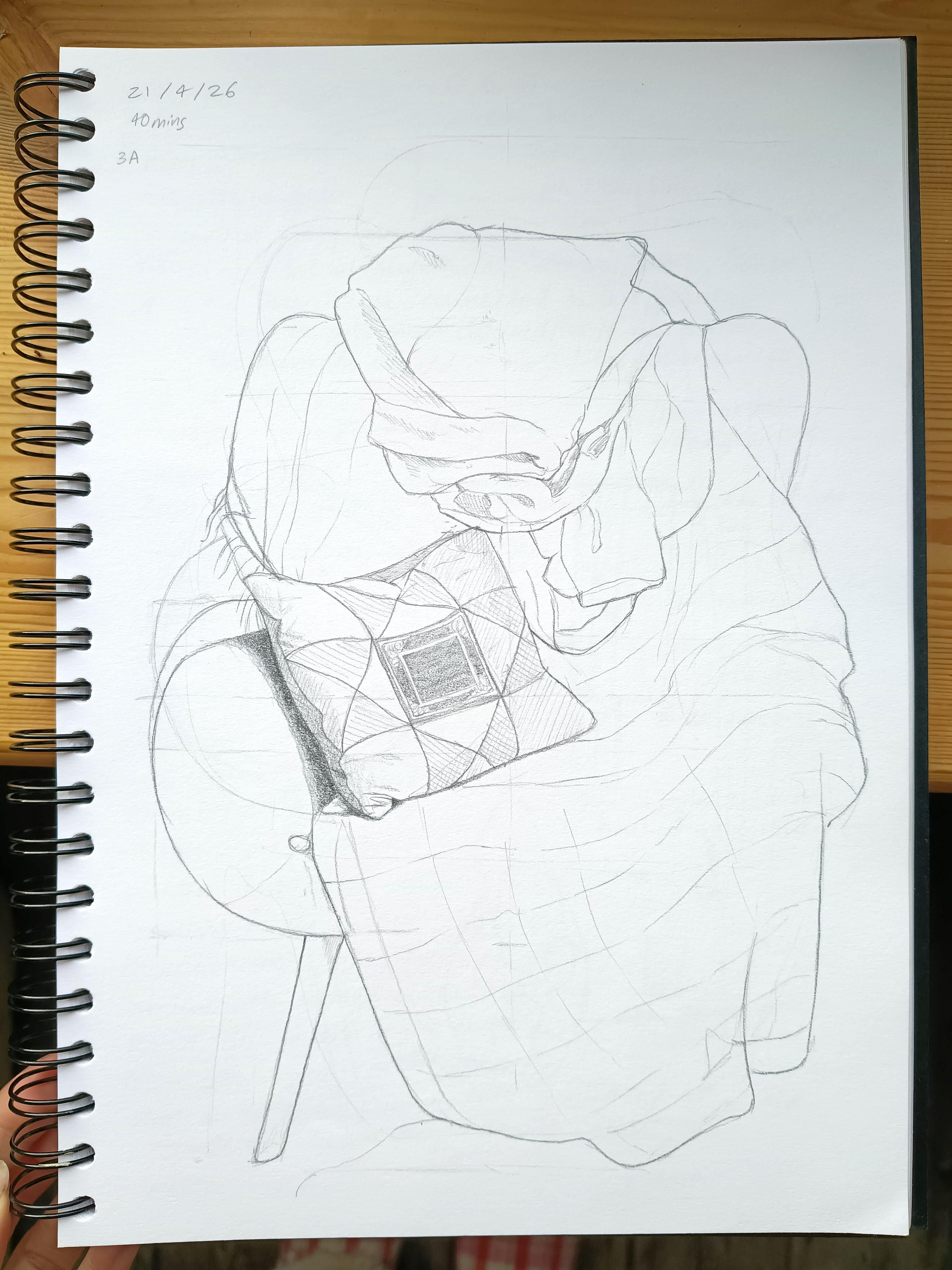
Recently, I’ve noticed my sketchbook drawings aren’t quite where I want them to be in terms of confidence and accuracy, so I decided to refresh my learning. I borrowed Keys to Drawing by Bert Dodson from my local library, and started approaching it like a self-directed art course. It still feels surprisingly free, and the tone is very calm and practical. Dodson reads as a patient teacher, rather than strict step-by-step instructions.
However, I quickly encountered a problem. Dodson suggests asking a friend to pose, and I don’t really have anyone who can sit still for half an hour! Life drawing classes aren’t accessible to me, either. What do I do in the situation?
Drawing from photos didn’t feel like the answer. It’s too easy to copy shapes without really seeing, and the results can feel flat. I wanted something that would still challenge me to observe properly. After thinking it over, I decided to draw furniture instead. I chose a chair piled with clothes and treated it like a figure. I used the techniques in the book: measuring with a pencil, finding midpoints and checking alignments.
Compared to drawing a plant or a still life, a chair gives clear feedback on whether proportions and angles are off. I realised how much I can get away with when drawing foliage, but if the legs are in the wrong place on a chair, the whole drawing looks off.
While drawing, I noticed an issue that hadn’t troubled me for some time. I had stopped using these measuring techniques years ago, because I ended up relying on them too heavily, and lost some of the liveliness of drawing, like gesture and my own personal style. However, avoiding measuring completely is probably part of the reason I’m no longer happy with my sketchbook work. By reintroducing these techniques, but using them only to inform parts of the process instead of the whole, I’m hopeful I can find the right balance.
The more I looked, the more the scene in front of me opened up and I noticed more folds and shadows. As I kept drawing, I felt tension dissolve in my brain and body, and I entered the elusive flow state, where time and worries disappear.
I set a time of 30-40 minutes, which meant leaving some part unfinished. This can be unsettling, but I’m learning to stop once my focus drops instead of forcing myself to keep going. Strangely, this has the opposite effect to what I expected; stopping early seems to improve my skills over time. I used to think pushing through the tedium was important, but it turns out I just end up creating bad habits through poor focus.
Dodson suggests following a checklist after completing the drawing, with questions such as ‘did I find the midpoint’ and ‘did I use measuring at least twice’. This has a brilliant effect of stopping the voice of judgment praising or condemning the drawing, instead treating it like a learning opportunity.
It’s not the same as life drawing, but until I can convince someone to pose for me, it’s a good way to practice observation. It’s important not to let obstacles stop you from pursuing your goals.
Illustration is more than decoration or making a beautiful image; it’s about communicating a message, and shares key principles with graphic design. It’s even referred to as “Visual Communication”.
The role of the illustrator is to convey a message clearly, or shape how it is interpreted, and can change depending on what that message is. For example, a map illustration may need to show accurate roads and display key landmarks, or it may need to give an overall feeling of a particular place and raise the viewer’s interest.
In order to communicate a message, you need to understand what exactly you are trying to convey. Some questions to ask include who is the target viewer and what is it for? How will it be seen, and what emotional response or reaction are you trying to create in your viewer? What do you want them to do after seeing it?
Inspiration for each item was from interviews leading up to the 2020 US presidential election. The colour palette is limited, and small details reward further looking. This was a fun project; I’d love to do another!
Let’s say you’re asked to create a book cover about Kamala Harris, aimed at young women who look up to her as a role model. You’re trying to pique their interest in reading the book. You and the client decide to explore Harris’ personality through illustrating the contents of her bag, as it is eye-catching and playful. What objects can you include to highlight various aspects of her personality? What colours can you use to get your message across?
What I’m getting at is that the illustrator needs to be mindful about how the viewer will interpret your message, and if it lines up with your intent. A ‘good’ illustration is a clear communication of your chosen message, presented in a way that also attracts attention.
When elements contradict each other, it creates confusion for your viewer. For the example above, the blue background was chosen to highlight Harris as a democrat, and red would make people think of republican politicians instead. Think of a green sign that says “stop”. We are used to green signs as a symbol for “go”, and this is the message we receive before reading the text. Another example could be a fruit illustration in murky, muddy colours, or a wellness retreat logo in aggressive heavy metal typeface.
As well as symbols, there are other aspects of shared understanding that can influence how an image is received, and can vary across different cultures. Colour, subject matter, and texture can all have an effect. The key is to look at design and illustration as a shared visual language.
I’ll discuss composition, colour and details in future posts, and how they can create meaning. I’m sure you’re already aware of various colour meanings, such as red signifying danger or passion, and green as a symbol for the natural world, but sometimes the way they interact can override their individual meanings, or strengthen shared meanings. Orange and blue are both vibrant colours that can show energy, and they intensify when combined.
As an example of composition, the book cover above is laid out in a seemingly carefree manner, suggesting we are either looking inside the bag, or the bag is haphazardly turned upside down and the contents have fallen out. The composition makes her a more relatable character, and a more interesting image, than if everything was presented in a very orderly fashion.
Illustration and design work hand in hand, and a background in graphic design work or study can elevate work to the next level. Design helps to organise information, while illustration helps create meaning and emotion, or trigger existing memories and association in the viewer. Images also stick in the mind longer than abstract information.
However, it’s worth noting that some work invites interpretation or ambiguity, such as gallery artwork or illustrations that sit next to an editorial piece that reveals more meaning. In that case, it’s sometimes better for the image to act as support for the text, and not duplicate the message. My sci-fi painting is an example of an illustration that works with a story, and invites the viewer’s curiosity to read on. Clear communication doesn’t always mean literal or obvious.
When you control how your work is presented, the message has a much better chance of being understood. If someone saw your work without context, would they understand it? What can you remove and still have the idea come across?
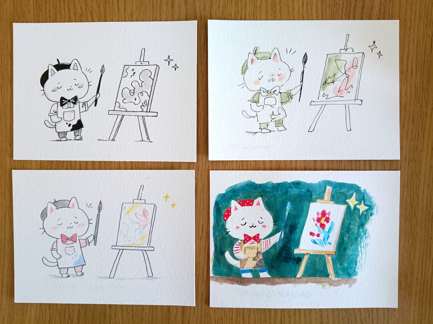
At art school, we had a project called “30×30”: we took the largest sheet of paper we could find, divided it into 30 squares, and created an illustration in each one. The goal was to use a different media or approach each time, to explore various methods and not get stuck in a style too early.
I revisit this exercise every so often when I need direction, but keep to a manageable number. For this illustration, I sketched an artist cat character and traced him onto postcard size watercolour paper.
Clockwise from top left: manga-style pen and marker; gouache paint; ink and watercolour; markers.
When doing this challenge, try to stay present and think about what you are enjoying creating, not just which result you like the look of at the end. Think also about what matches your personality and what the different approaches could be used for. In the example above, the top left would work well for children’s novels, while the bottom right could work for attention-grabbing advertising.
Clockwise from top left: manga-style pen and marker; ink and watercolour; brush pen and colour pencil; gouache paint.
I’m happier with this second set, and hopefully they show the range you can achieve with the same tools and sketch; the black and white one this time is more carefully drawn with attention on line weight, while the ink and watercolour has more spontaneity than the previous one. The top left drawing would be great for books or blogposts. The messy watercolour one was fun to do but not instantly readable, so I’m not sure what it could be used for. The bottom left one is a style I often use in my journal since it has a calm and thoughtful vibe, while the bottom right painting is my current go-to style for finished works.
Finally, I made a couple of digital variations. I’ve wanted to try out a simple line and mono-colour style for a while (left) which could also work for books; the right-hand one is how I usually draw my custom map illustrations. Both are made with a stylus on iPad with Procreate. Digital work is great for editing with its undo tool, but I find more and more that there’s something limiting about drawing on glass, and it doesn’t feel as real as mixing up paint or drawing in pen.
I started this exercise thinking I’d find one correct answer to make illustrations, but I’ll admit I’m even more confused as to what direction to take. I think this is where the analytical brain needs to hold off from evaluating, and I’ll continue to experiment with the various methods I’ve come up with today. I predict that I’ll naturally lean more to certain styles, and others will merge together as I progress. It’s a nice set that I can share with others, and if a client prefers a certain look, I can create that for them.
If you’ve read this far, I’d love to know your thoughts on which ones you’d like to see more of. Thanks for reading!
Most weeks, I sit down with pen and paper and write or draw whatever’s on my mind. I started with a cheap notebook and pen, but gradually I’ve learned that quality paper and writing tools are worth spending a little more on. Once you’re over the fear of ruining nice paper, you start to enjoy the process of a smoother writing experience, or making drawings without lines railroading through them.
Here are a few recent spreads, and tips for journaling and sharing entries.
I’ve tried different books and layouts over time, and this year switched from Hobonichi to Midori MD blank. In some ways, I miss the structure of a guided planner, and it can be a little intimidating to start a fresh page with no pre-written dates, grids, quotes, tick boxes, daily quotes etc there. It’s as if the structure felt like a companion urging me to write, and now I’m on my own. However, embracing the blank page has helped me explore creativity, and there’s no pain in missing days or writing about something other than today’s events. The paper in the MD notebook is cream, which I find less tiring to look at and gives a softer feel than a bright white page.
To create the page above, I printed a grid of 5mm squares (1/4”) and put it behind the page to guide my writing, with a paperclip to hold it in place. For transparency, I’m showing my very best pages here, and I added a little to this spread over a few evenings. Not all my pages turn out like this, but it’s fun when they do. I used coloured pencils and a grey pen for the illustrations, and a fountain pen for the text.
I browse Pinterest or magazines for design inspiration, and this spread features a layout I copied (left page). Since it’s for my journal, it’s ok to do this, and learn more about layout. I used this spread to record notes from the book, Applied Imagination. The icons don’t have to be perfect, but can be useful for finding information quickly or remembering key points. Sticking to two tools/colours helps get past having too much choice, and always works well. I used a blue fountain pen and pink colour pencil here. Again, this spread was added to over time.
I am often stuck in a paradox of wanting to share my pages with others and hopefully find other journalers, and wanting to keep everything private. One idea I’m testing is to leave enough time between creating and sharing. This spread was made at the end of January, and leaving time helps evaluate whether or not I want to share it. I would hate to end up creating pages specifically for sharing, and change the way I make them. This spread was created in a single evening, and it’s not perfect by any means but is a nice record of the day. I find it easier to just write and draw than add stamps and stickers, but everyone is different and you find what works for you.
Another tip is to keep different notebooks for different purposes. If something is really bugging me or I’m annoyed with something, I prefer to just write for ten minutes without stopping, in a book that isn’t so precious. For me at least, it’s easier to reflect on what I’m thinking when I write it down by hand, than to speak it aloud or write it on a phon or computer. In that kind of book, I can say whatever I want without censoring myself, as the point is to process thoughts and not read them back later. With the book I shared above, I want to keep everything in a more positive frame. I keep a separate sketchbook where I can be messy and make ugly drawings. I tried to keep everything in one place before, and it just felt too chaotic. The Midori MD has become more of a “highlight reel” that I want to reread, but even so, I keep it authentic to my life as much as possible.
When I started journaling, I wasn’t sure what to write, and I got bored of writing down the weather, meals I ate and so on. I was despondent, because my life looked pretty much the same day-to-day, and felt boring. However, if you pay attention, you realise no day is the same as the one before. There’s always something new to see or do or overhear. I have a notes app on my phone to log events, thoughts and observations throughout the day, and spend time after dinner reflecting on key moments. Through recording my life this way, taking time to remember and reflect, I feel I’ve grown a little since yesterday. Journaling is a way to pause between life’s chaotic activities, and I’m finding other moments to just ‘be’. I see a lot of people on Substack report how great they feel with an analogue lifestyle or going without their phone, but I don’t think you need to go without technology to become more present and aware; just make sure you have moments of mindfulness throughout the day, allow your brain to rest a little.
I’d love to connect with other stationery enthusiasts and/or journalers, so do comment if you made it to the end!
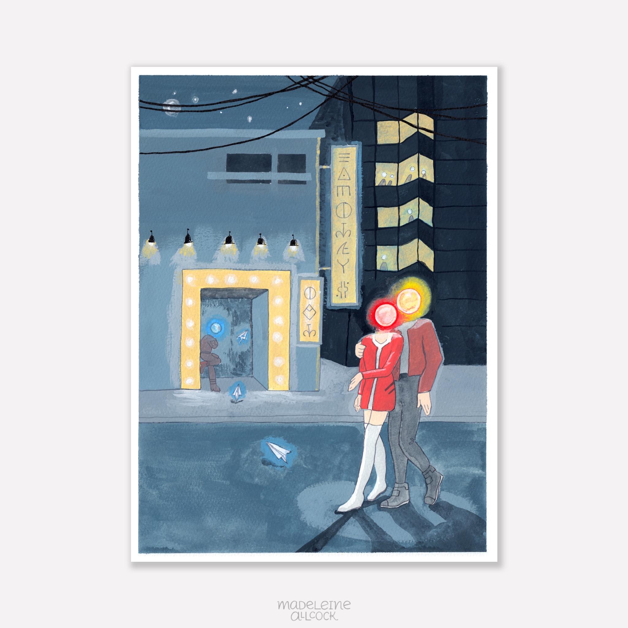
I’m part of an art group that meets weekly at a local library. When I moved to Dorset, I didn’t know any creative people, and missed the camaraderie of the gallery in Banbury. Having a time to meet with others and draw together is valuable to me, it helps to feel part of a group of people who love making art. There are no classes or critiques, and everyone works on their own thing. The library occasionally puts on exhibitions of the members works, and this time, the theme was Science Fiction. It took a while to come up with an idea, as it’s not a genre I usually explore in art. I enjoy reading about it from time to time, but it doesn’t translate into painting ideas for me, as I’m not interested in machinery, robots, aliens etc.
Night Life
This painting, Night Life, shows a couple with glowing orbs for heads outside a theatre in a city. Their heads are warm colours, in contrast to the muted blue-grey background and distant character. Electronic paper planes drift through the scene, and the signs are written in a futuristic language. It’s designed to lead the eye straight to the couple, then to the doorway, along the sign and back to the couple again.
Racking my brains for ideas and getting nowhere, I turned to stock photography to at least practice drawing cityscapes, as I had a vague idea that a city is a good starting point for futuristic artwork. While browsing, one photo stood out to me, of a man obscured behind a lantern in a crowded Tokyo street. I thought his head looked like it was the lantern itself, and I sketched characters with this idea. However, the idea of the lantern heads didn’t feel right, partly because of the cultural associations with paper lanterns. I might explore the idea in the future, but it would need a clear reason for being there. I expanded the idea, and made the heads glowing light orbs instead.
I sketched various compositions, and thought about how the heads could express emotion through the colours alone, with red/yellow representing connection and warmth, and blue representing loneliness, a theme I’ve explored before in my art.
Using a lightbox to transfer the sketch to watercolour paper.
I didn’t start with a fixed meaning for this painting, and I like that it’s ended up as open to interpretation. I added the paper planes to the sketch at the last moment, as small, anonymous messages drifting through the scene.
The process of this piece wasn’t smooth, and there were various aspects I found challenging. The theme itself was outside of my comfort zone, and the figures, glowing idea, and telling a story through colour and light alone began to feel intimidating. At one point I was convinced I’d ruined it, which is usually a sign I’m halfway through. I’m getting better at pushing through feelings of self-doubt and negative thoughts. With digital work, you can adjust it to your heart’s content, but traditional painting as a ‘one shot’, performance feeling to it.
I started with a monochromatic blue-grey background, focusing on values.
The background is created with a mixture of blue, black and white gouache to create a monochromatic city. Blue feels colder and more alive than grey on its own, which can feel flat. I used a square shape brush to get sharp edges. I layered more paint on top until the contrast looked right, keeping in mind that the couple and lights should stand out.
The glowing heads didn’t look right and it took a while to work out how to get the effect I wanted. I tried a few techniques in a sketchbook, and settled on a wet-in-wet technique by first applying water, then the background colour around the outer edge, followed by the head-glow colour on the inner edge, and letting them bleed together.
The glowing heads were the biggest challenge in this piece.
Through creating this painting, I learned that I prefer graphic, playful work, and that ideas can emerge after making as well as before. When I paint a scene, in some ways I am transported into it while painting, and this meditative, transportation element makes creating art a lot of fun. Working out how to paint the glowing heads, and where shadows should fall, are techniques I can use for future pieces. After framing it and stepping back, I realised this difficult piece is actually one of my stronger works. This is why it’s important to finish paintings even if you are struggling partway through.
The finished painting before scanning.
Even though it’s a different theme from the rest of my work, the painting style, colours, dreamlike imagery and surreal feeling link to my portfolio as a whole. I think it’s not worth worrying about a style and restricting yourself to a comfort zone, as your artistic voice will come out in every piece regardless.
On reflection, I think I would make another painting like this, and it’s great to challenge what I think I’m capable of. I’d be really interested in how others interpret it. I learned about the ways I like to work, techniques to try again, and perseverance in pushing through difficult work. Night Life will be at Gillingham Library, Dorset, from 7 – 21 April 2026.
The only natural aspect is the crescent moon, which is obscured by wires, adding to the coldness of the scene.The background figure is in soft, muted colours so as not to attract attention.The background shows a glowing sign, and other people with glowing heads in a tower block.
Self-directed project celebrating Cropredy Festival
Most maps are designed to get you from one place to another. Illustrated maps do something slightly different: they help you understand and connect with a place.
What I love about hand drawn maps
Illustrated maps are some of my favourite projects to work on. They require a different approach to problem solving than illustrating scenes or spot images, combining visual storytelling with clear communication. They are often packed with dozens of smaller illustrations, and need to communicate at least a sense of place, or a highly accurate, usable guide to an area. They reward slow looking, and often involve adding storytelling as well as landmarks. My background in graphic design proves useful here, where skills in clarity and visual communication are important.
Who commissions map illustrations?
Commissioners for map illustration are as varied as the maps themselves, and range from:
heritage organisations such as The National Trust
tourism boards, e.g. Visit Dorset
festivals and events (see my Cropredy Festival map above, or YPO’s family fun map on my map section)
publishing (books and magazines)
universities
local councils (Banbury BID leaflet)
church parishes to show all churches covered by a single vicar
gift shops; I worked with Hyde & Seek in Exeter and Banbury Museum)
arts organisations (I helped Banbury-based artists create a studio location guide for Oxfordshire Artweeks)
planning development committees (I created a map for Kwun Tong in Hong Kong)
personal clients: e.g. weddings and birthday parties
Due to this variety, each map requires a different approach, tailored to the needs of the commissioner. For example, an illustrated city map celebrating a sense of place for a gift shop has an emphasis on popular landmarks, activities and local stories. A map for a heritage organisation might require all roads and connections to be clearly visible and useful for planning walking routes. An event map designed with children and families in mind will be different to an estate agent’s map aimed at promoting their ‘patch’ to young working professionals.
Some maps can act as a sense of community: for example, a map celebrating an annual festival resonated strongly with people in 2020, when the festival had to be cancelled due to the pandemic, and people shared their memories, feeling that purchasing the map enabled them to continue to take part in the event. A town map for Banbury was popular among locals who took pride in the town.
In all cases, they need to communicate a sense of place in a memorable way.
Research and Planning
After receiving a commission for a map and establishing contracts and payment, I start with researching the location and the client’s needs for the project. If it is accessible, I visit the location and make sketches and photographs of various landmarks, spending time in the area to get a sense of place and story. If the location is far away, I rely on a mix of google maps street view, any photographs the client has, and online images.
Using Google maps to plot in the relevant locations for a map of Marylebone. Below: as well as sketching on location and taking my own photographs, I reference online images to see how shopfronts change throughout the day and year.
Sometimes the only images available have strange perspectives and angles that don’t work in my flat style, so I work out the general shapes and how the buildings and landmarks might look facing straight on. For example, in my location map for an area in Hong Kong, the challenge was twofold: not only was it impossible to get to in person, a majority of the landmarks were in proposed development, and I relied on the client’s architectural sketches and descriptions.
I work with the client to choose around 10-12 landmarks and icons, and balance accuracy with purpose and visual taste.
Sketching the layout
Pencil sketch outlining roads and canals for the Banbury map.
I use various map tools to layout the area, marking in roads, rivers and grassy areas. Google maps is again great for this, but it’s also useful to use map tools from councils and ordinance surveys. At this stage I have a rough idea for positions of landmarks, but since they are created digitally most of the time, in contrast to my narrative illustrations, it is simple to move or swap them at a later date.
I use Apple Pencil and Procreate for iPad, which allows me to hand draw the maps directly onto the screen, and still create a digital file. At this stage, I focus on keeping the composition readable, the landmarks simple, and the overall illustration appealing.
I work on a colour palette, which is either given by the client to match their branding, or I interpret depending on the mood and atmosphere of the place that I’m attempting to convey. The maps usually have North at the top, but some layouts benefit from rotation. In rare instances, I have stretched or squashed distances for readability, but this is always with explicit approval from the client.
Adding detail
Even though it’s at the sketch stage, I create a professional slide deck to share the files with the client. This is especially helpful if they are acting as a middle man and need to present it to their clients. I also include the individual sketch files.
I draw the buildings, characters, wildlife and trees carefully, taking note of stone colour and features unique to the sense of place. This could include local secrets that help people feel seen if they are ‘in the know’, or elicit curiosity in those that don’t. For example, the event map for Fairport’s Cropredy Convention features an alien flag that a particular fan brings every year, and other fans use as a landmark to meet friends. I was honoured to receive a heartfelt letter from the owner of this flag. I hand letter the typography, add any banners or symbols needed, and create a title. Every map has a compass to indicate North.
The finished map of Marylebone. The client chose the colour palette, and requested a second version with a plain white background.
Once the design is finalised, I send it to the client and await feedback on any alterations. I include three rounds of changes as standard, and then charge hourly for anything after that. One map in particular had a large committee working on it, with each member having a different aim for the map, which can get complicated. The files are finally prepared for use as posters, brochures, websites, signage or publications.
For more maps, see here. I’m always interested in new map illustration projects, so if you’re looking for a custom design for your business or event, feel free to get in touch. If you enjoyed learning about the illustration process, subscribe for more posts like this.