Most maps are designed to get you from one place to another. Illustrated maps do something slightly different: they help you understand and connect with a place.
What I love about hand drawn maps
Illustrated maps are some of my favourite projects to work on. They require a different approach to problem solving than illustrating scenes or spot images, combining visual storytelling with clear communication. They are often packed with dozens of smaller illustrations, and need to communicate at least a sense of place, or a highly accurate, usable guide to an area. They reward slow looking, and often involve adding storytelling as well as landmarks. My background in graphic design proves useful here, where skills in clarity and visual communication are important.
Who commissions map illustrations?
Commissioners for map illustration are as varied as the maps themselves, and range from:
- heritage organisations such as The National Trust
- tourism boards, e.g. Visit Dorset
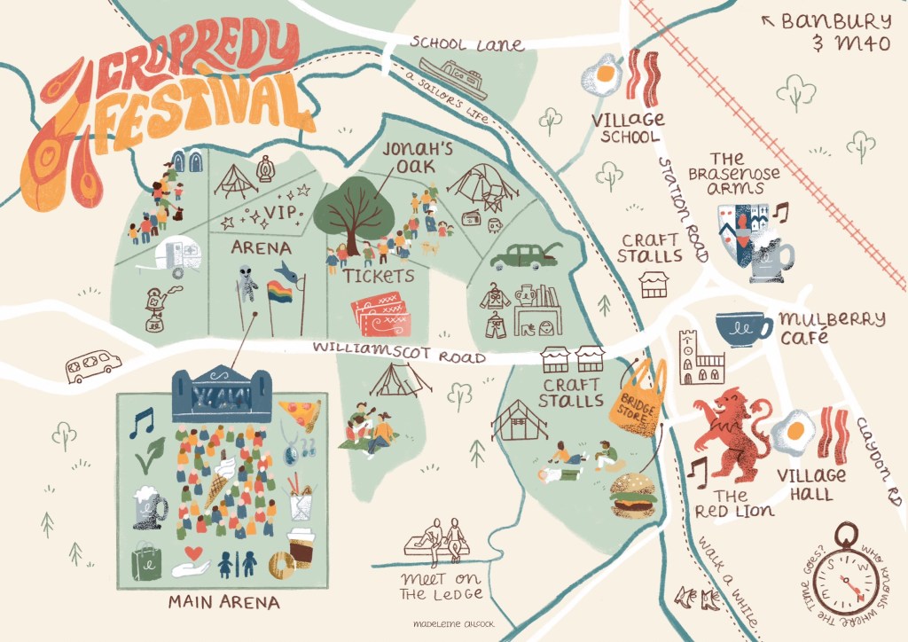
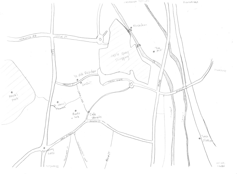
- festivals and events (see my Cropredy Festival map above, or YPO’s family fun map on my map section)
- publishing (books and magazines)
- universities
- local councils (Banbury BID leaflet)
- church parishes to show all churches covered by a single vicar
- gift shops; I worked with Hyde & Seek in Exeter and Banbury Museum)
- galleries
- arts organisations (I helped Banbury-based artists create a studio location guide for Oxfordshire Artweeks)
- planning development committees (I created a map for Kwun Tong in Hong Kong)
- personal clients: e.g. weddings and birthday parties
Due to this variety, each map requires a different approach, tailored to the needs of the commissioner. For example, an illustrated city map celebrating a sense of place for a gift shop has an emphasis on popular landmarks, activities and local stories. A map for a heritage organisation might require all roads and connections to be clearly visible and useful for planning walking routes. An event map designed with children and families in mind will be different to an estate agent’s map aimed at promoting their ‘patch’ to young working professionals.
Some maps can act as a sense of community: for example, a map celebrating an annual festival resonated strongly with people in 2020, when the festival had to be cancelled due to the pandemic, and people shared their memories, feeling that purchasing the map enabled them to continue to take part in the event. A town map for Banbury was popular among locals who took pride in the town.
In all cases, they need to communicate a sense of place in a memorable way.
Research and Planning
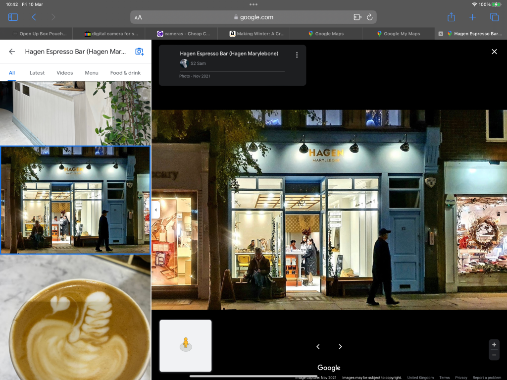
After receiving a commission for a map and establishing contracts and payment, I start with researching the location and the client’s needs for the project. If it is accessible, I visit the location and make sketches and photographs of various landmarks, spending time in the area to get a sense of place and story. If the location is far away, I rely on a mix of google maps street view, any photographs the client has, and online images.
Sometimes the only images available have strange perspectives and angles that don’t work in my flat style, so I work out the general shapes and how the buildings and landmarks might look facing straight on. For example, in my location map for an area in Hong Kong, the challenge was twofold: not only was it impossible to get to in person, a majority of the landmarks were in proposed development, and I relied on the client’s architectural sketches and descriptions.
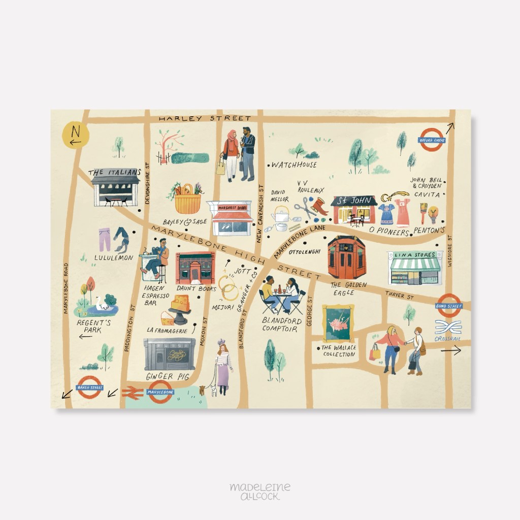
I work with the client to choose around 10-12 landmarks and icons, and balance accuracy with purpose and visual taste.
Sketching the layout
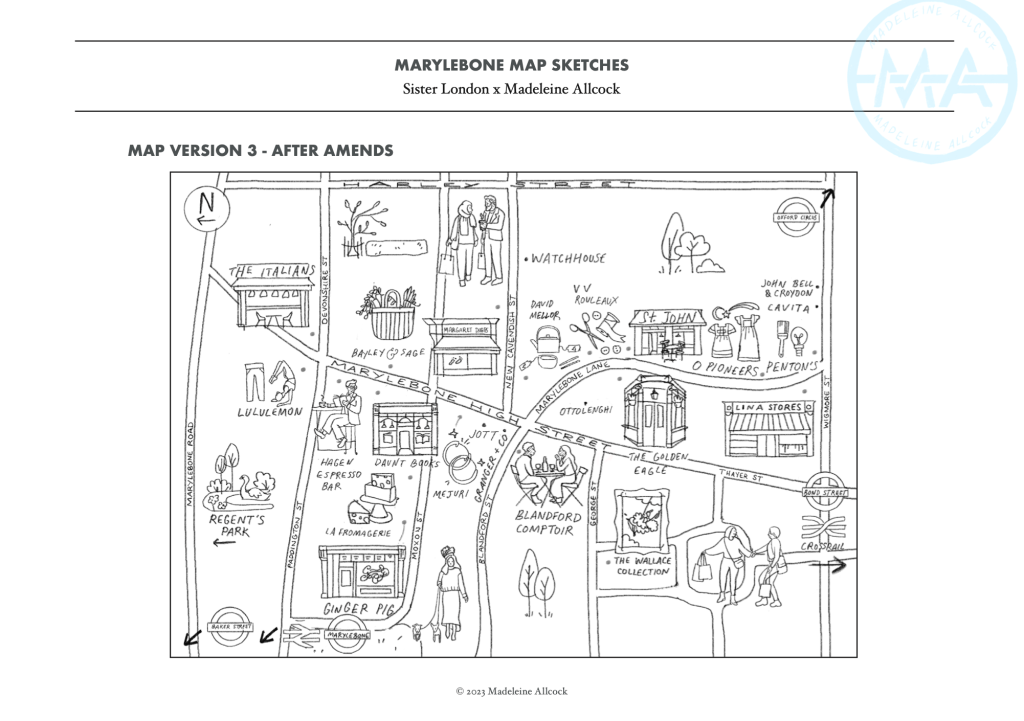
I use various map tools to layout the area, marking in roads, rivers and grassy areas. Google maps is again great for this, but it’s also useful to use map tools from councils and ordinance surveys. At this stage I have a rough idea for positions of landmarks, but since they are created digitally most of the time, in contrast to my narrative illustrations, it is simple to move or swap them at a later date.
I use Apple Pencil and Procreate for iPad, which allows me to hand draw the maps directly onto the screen, and still create a digital file. At this stage, I focus on keeping the composition readable, the landmarks simple, and the overall illustration appealing.
I work on a colour palette, which is either given by the client to match their branding, or I interpret depending on the mood and atmosphere of the place that I’m attempting to convey. The maps usually have North at the top, but some layouts benefit from rotation. In rare instances, I have stretched or squashed distances for readability, but this is always with explicit approval from the client.
Adding detail
I draw the buildings, characters, wildlife and trees carefully, taking note of stone colour and features unique to the sense of place. This could include local secrets that help people feel seen if they are ‘in the know’, or elicit curiosity in those that don’t. For example, the event map for Fairport’s Cropredy Convention features an alien flag that a particular fan brings every year, and other fans use as a landmark to meet friends. I was honoured to receive a heartfelt letter from the owner of this flag. I hand letter the typography, add any banners or symbols needed, and create a title. Every map has a compass to indicate North.
Once the design is finalised, I send it to the client and await feedback on any alterations. I include three rounds of changes as standard, and then charge hourly for anything after that. One map in particular had a large committee working on it, with each member having a different aim for the map, which can get complicated. The files are finally prepared for use as posters, brochures, websites, signage or publications.
For more maps, see here. I’m always interested in new map illustration projects, so if you’re looking for a custom design for your business or event, feel free to get in touch. If you enjoyed learning about the illustration process, subscribe for more posts like this.

Leave a comment