Tag: writing

  • Recent Journal Spreads

    Recent Journal Spreads

    Most weeks, I sit down with pen and paper and write or draw whatever’s on my mind. I started with a cheap notebook and pen, but gradually I’ve learned that quality paper and writing tools are worth spending a little more on. Once you’re over the fear of ruining nice paper, you start to enjoy the process of a smoother writing experience, or making drawings without lines railroading through them.

    Here are a few recent spreads, and tips for journaling and sharing entries.

    I’ve tried different books and layouts over time, and this year switched from Hobonichi to Midori MD blank. In some ways, I miss the structure of a guided planner, and it can be a little intimidating to start a fresh page with no pre-written dates, grids, quotes, tick boxes, daily quotes etc there. It’s as if the structure felt like a companion urging me to write, and now I’m on my own. However, embracing the blank page has helped me explore creativity, and there’s no pain in missing days or writing about something other than today’s events. The paper in the MD notebook is cream, which I find less tiring to look at and gives a softer feel than a bright white page.

    To create the page above, I printed a grid of 5mm squares (1/4”) and put it behind the page to guide my writing, with a paperclip to hold it in place. For transparency, I’m showing my very best pages here, and I added a little to this spread over a few evenings. Not all my pages turn out like this, but it’s fun when they do. I used coloured pencils and a grey pen for the illustrations, and a fountain pen for the text.

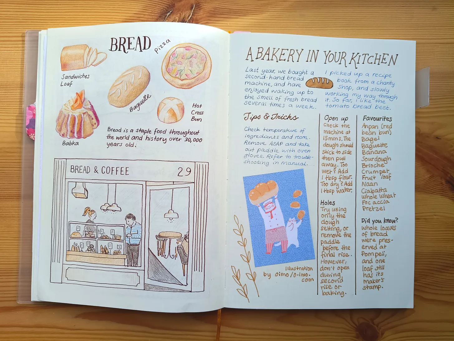
    I browse Pinterest or magazines for design inspiration, and this spread features a layout I copied (left page). Since it’s for my journal, it’s ok to do this, and learn more about layout. I used this spread to record notes from the book, Applied Imagination. The icons don’t have to be perfect, but can be useful for finding information quickly or remembering key points. Sticking to two tools/colours helps get past having too much choice, and always works well. I used a blue fountain pen and pink colour pencil here. Again, this spread was added to over time.

    I am often stuck in a paradox of wanting to share my pages with others and hopefully find other journalers, and wanting to keep everything private. One idea I’m testing is to leave enough time between creating and sharing. This spread was made at the end of January, and leaving time helps evaluate whether or not I want to share it. I would hate to end up creating pages specifically for sharing, and change the way I make them. This spread was created in a single evening, and it’s not perfect by any means but is a nice record of the day. I find it easier to just write and draw than add stamps and stickers, but everyone is different and you find what works for you.

    Another tip is to keep different notebooks for different purposes. If something is really bugging me or I’m annoyed with something, I prefer to just write for ten minutes without stopping, in a book that isn’t so precious. For me at least, it’s easier to reflect on what I’m thinking when I write it down by hand, than to speak it aloud or write it on a phon or computer. In that kind of book, I can say whatever I want without censoring myself, as the point is to process thoughts and not read them back later. With the book I shared above, I want to keep everything in a more positive frame. I keep a separate sketchbook where I can be messy and make ugly drawings. I tried to keep everything in one place before, and it just felt too chaotic. The Midori MD has become more of a “highlight reel” that I want to reread, but even so, I keep it authentic to my life as much as possible.

    When I started journaling, I wasn’t sure what to write, and I got bored of writing down the weather, meals I ate and so on. I was despondent, because my life looked pretty much the same day-to-day, and felt boring. However, if you pay attention, you realise no day is the same as the one before. There’s always something new to see or do or overhear. I have a notes app on my phone to log events, thoughts and observations throughout the day, and spend time after dinner reflecting on key moments. Through recording my life this way, taking time to remember and reflect, I feel I’ve grown a little since yesterday. Journaling is a way to pause between life’s chaotic activities, and I’m finding other moments to just ‘be’. I see a lot of people on Substack report how great they feel with an analogue lifestyle or going without their phone, but I don’t think you need to go without technology to become more present and aware; just make sure you have moments of mindfulness throughout the day, allow your brain to rest a little.

    I’d love to connect with other stationery enthusiasts and/or journalers, so do comment if you made it to the end!

    XOXO

    Madeleine

  • Glowing Heads and Paper Planes: Painting Science Fiction

    Glowing Heads and Paper Planes: Painting Science Fiction

    I’m part of an art group that meets weekly at a local library. When I moved to Dorset, I didn’t know any creative people, and missed the camaraderie of the gallery in Banbury. Having a time to meet with others and draw together is valuable to me, it helps to feel part of a group of people who love making art. There are no classes or critiques, and everyone works on their own thing. The library occasionally puts on exhibitions of the members works, and this time, the theme was Science Fiction. It took a while to come up with an idea, as it’s not a genre I usually explore in art. I enjoy reading about it from time to time, but it doesn’t translate into painting ideas for me, as I’m not interested in machinery, robots, aliens etc.

    Night Life

    This painting, Night Life, shows a couple with glowing orbs for heads outside a theatre in a city. Their heads are warm colours, in contrast to the muted blue-grey background and distant character. Electronic paper planes drift through the scene, and the signs are written in a futuristic language. It’s designed to lead the eye straight to the couple, then to the doorway, along the sign and back to the couple again.

    Photo by Deniz Demir on Unsplash

    Racking my brains for ideas and getting nowhere, I turned to stock photography to at least practice drawing cityscapes, as I had a vague idea that a city is a good starting point for futuristic artwork. While browsing, one photo stood out to me, of a man obscured behind a lantern in a crowded Tokyo street. I thought his head looked like it was the lantern itself, and I sketched characters with this idea. However, the idea of the lantern heads didn’t feel right, partly because of the cultural associations with paper lanterns. I might explore the idea in the future, but it would need a clear reason for being there. I expanded the idea, and made the heads glowing light orbs instead. 

    I sketched various compositions, and thought about how the heads could express emotion through the colours alone, with red/yellow representing connection and warmth, and blue representing loneliness, a theme I’ve explored before in my art.

    Using a lightbox to transfer the sketch to watercolour paper.

    I didn’t start with a fixed meaning for this painting, and I like that it’s ended up as open to interpretation. I added the paper planes to the sketch at the last moment, as small, anonymous messages drifting through the scene. 

    The process of this piece wasn’t smooth, and there were various aspects I found challenging. The theme itself was outside of my comfort zone, and the figures, glowing idea, and telling a story through colour and light alone began to feel intimidating. At one point I was convinced I’d ruined it, which is usually a sign I’m halfway through. I’m getting better at pushing through feelings of self-doubt and negative thoughts. With digital work, you can adjust it to your heart’s content, but traditional painting as a ‘one shot’, performance feeling to it.

    I started with a monochromatic blue-grey background, focusing on values.

    The background is created with a mixture of blue, black and white gouache to create a monochromatic city. Blue feels colder and more alive than grey on its own, which can feel flat. I used a square shape brush to get sharp edges. I layered more paint on top until the contrast looked right, keeping in mind that the couple and lights should stand out.

    The glowing heads didn’t look right and it took a while to work out how to get the effect I wanted. I tried a few techniques in a sketchbook, and settled on a wet-in-wet technique by first applying water, then the background colour around the outer edge, followed by the head-glow colour on the inner edge, and letting them bleed together.

    The glowing heads were the biggest challenge in this piece.

    Through creating this painting, I learned that I prefer graphic, playful work, and that ideas can emerge after making as well as before. When I paint a scene, in some ways I am transported into it while painting, and this meditative, transportation element makes creating art a lot of fun. Working out how to paint the glowing heads, and where shadows should fall, are techniques I can use for future pieces. After framing it and stepping back, I realised this difficult piece is actually one of my stronger works. This is why it’s important to finish paintings even if you are struggling partway through.

    The finished painting before scanning.

    Even though it’s a different theme from the rest of my work, the painting style, colours, dreamlike imagery and surreal feeling link to my portfolio as a whole. I think it’s not worth worrying about a style and restricting yourself to a comfort zone, as your artistic voice will come out in every piece regardless.

    On reflection, I think I would make another painting like this, and it’s great to challenge what I think I’m capable of. I’d be really interested in how others interpret it. I learned about the ways I like to work, techniques to try again, and perseverance in pushing through difficult work. Night Life will be at Gillingham Library, Dorset, from 7 – 21 April 2026.

    The only natural aspect is the crescent moon, which is obscured by wires, adding to the coldness of the scene.
    The background figure is in soft, muted colours so as not to attract attention.
    The background shows a glowing sign, and other people with glowing heads in a tower block.
  • From Research to Final Artwork: A Process for Creating Illustrated Maps

    From Research to Final Artwork: A Process for Creating Illustrated Maps

    Self-directed project celebrating Cropredy Festival

    Most maps are designed to get you from one place to another. Illustrated maps do something slightly different: they help you understand and connect with a place.

    What I love about hand drawn maps

    Illustrated maps are some of my favourite projects to work on. They require a different approach to problem solving than illustrating scenes or spot images, combining visual storytelling with clear communication. They are often packed with dozens of smaller illustrations, and need to communicate at least a sense of place, or a highly accurate, usable guide to an area. They reward slow looking, and often involve adding storytelling as well as landmarks. My background in graphic design proves useful here, where skills in clarity and visual communication are important.

    Who commissions map illustrations?

    Commissioners for map illustration are as varied as the maps themselves, and range from:

    • heritage organisations such as The National Trust
    • tourism boards, e.g. Visit Dorset
    • festivals and events (see my Cropredy Festival map above, or YPO’s family fun map on my map section)
    • publishing (books and magazines)
    • universities
    • local councils (Banbury BID leaflet)
    • church parishes to show all churches covered by a single vicar
    • gift shops; I worked with Hyde & Seek in Exeter and Banbury Museum)
    • galleries
    • arts organisations (I helped Banbury-based artists create a studio location guide for Oxfordshire Artweeks)
    • planning development committees (I created a map for Kwun Tong in Hong Kong)
    • personal clients: e.g. weddings and birthday parties

    Due to this variety, each map requires a different approach, tailored to the needs of the commissioner. For example, an illustrated city map celebrating a sense of place for a gift shop has an emphasis on popular landmarks, activities and local stories. A map for a heritage organisation might require all roads and connections to be clearly visible and useful for planning walking routes. An event map designed with children and families in mind will be different to an estate agent’s map aimed at promoting their ‘patch’ to young working professionals.

    Some maps can act as a sense of community: for example, a map celebrating an annual festival resonated strongly with people in 2020, when the festival had to be cancelled due to the pandemic, and people shared their memories, feeling that purchasing the map enabled them to continue to take part in the event. A town map for Banbury was popular among locals who took pride in the town.

    In all cases, they need to communicate a sense of place in a memorable way.

    Research and Planning

    After receiving a commission for a map and establishing contracts and payment, I start with researching the location and the client’s needs for the project. If it is accessible, I visit the location and make sketches and photographs of various landmarks, spending time in the area to get a sense of place and story. If the location is far away, I rely on a mix of google maps street view, any photographs the client has, and online images.

    Using Google maps to plot in the relevant locations for a map of Marylebone. Below: as well as sketching on location and taking my own photographs, I reference online images to see how shopfronts change throughout the day and year.

    Sometimes the only images available have strange perspectives and angles that don’t work in my flat style, so I work out the general shapes and how the buildings and landmarks might look facing straight on. For example, in my location map for an area in Hong Kong, the challenge was twofold: not only was it impossible to get to in person, a majority of the landmarks were in proposed development, and I relied on the client’s architectural sketches and descriptions.

    I work with the client to choose around 10-12 landmarks and icons, and balance accuracy with purpose and visual taste.

    Sketching the layout

    Pencil sketch outlining roads and canals for the Banbury map.

    I use various map tools to layout the area, marking in roads, rivers and grassy areas. Google maps is again great for this, but it’s also useful to use map tools from councils and ordinance surveys. At this stage I have a rough idea for positions of landmarks, but since they are created digitally most of the time, in contrast to my narrative illustrations, it is simple to move or swap them at a later date.

    I use Apple Pencil and Procreate for iPad, which allows me to hand draw the maps directly onto the screen, and still create a digital file. At this stage, I focus on keeping the composition readable, the landmarks simple, and the overall illustration appealing.

    I work on a colour palette, which is either given by the client to match their branding, or I interpret depending on the mood and atmosphere of the place that I’m attempting to convey. The maps usually have North at the top, but some layouts benefit from rotation. In rare instances, I have stretched or squashed distances for readability, but this is always with explicit approval from the client.

    Adding detail

    Even though it’s at the sketch stage, I create a professional slide deck to share the files with the client. This is especially helpful if they are acting as a middle man and need to present it to their clients. I also include the individual sketch files.

    I draw the buildings, characters, wildlife and trees carefully, taking note of stone colour and features unique to the sense of place. This could include local secrets that help people feel seen if they are ‘in the know’, or elicit curiosity in those that don’t. For example, the event map for Fairport’s Cropredy Convention features an alien flag that a particular fan brings every year, and other fans use as a landmark to meet friends. I was honoured to receive a heartfelt letter from the owner of this flag. I hand letter the typography, add any banners or symbols needed, and create a title. Every map has a compass to indicate North.

    The finished map of Marylebone. The client chose the colour palette, and requested a second version with a plain white background.

    Once the design is finalised, I send it to the client and await feedback on any alterations. I include three rounds of changes as standard, and then charge hourly for anything after that. One map in particular had a large committee working on it, with each member having a different aim for the map, which can get complicated. The files are finally prepared for use as posters, brochures, websites, signage or publications.

    For more maps, see here. I’m always interested in new map illustration projects, so if you’re looking for a custom design for your business or event, feel free to get in touch. If you enjoyed learning about the illustration process, subscribe for more posts like this.