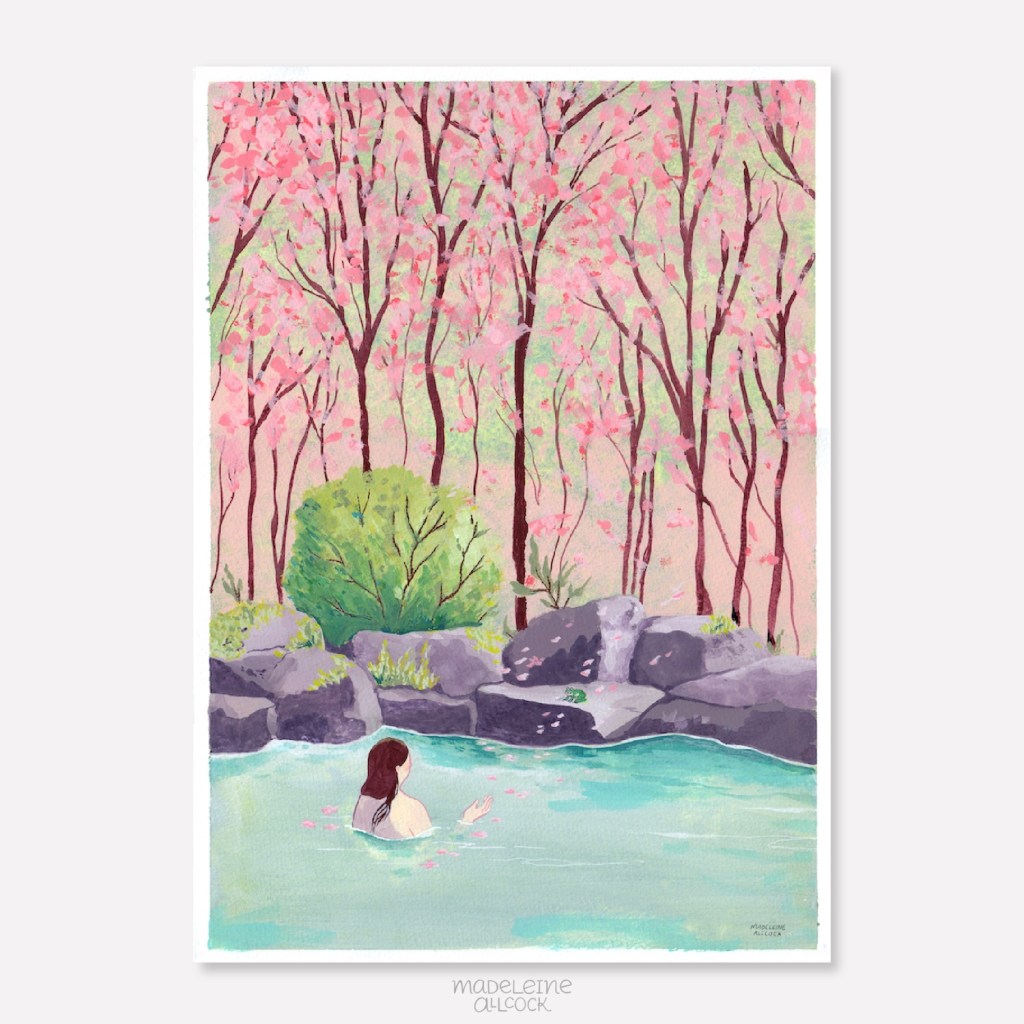
Latest painting, inspired by spring blossoms, hot springs and fairytales. A travel guide to Japan had me fantasising about sakura flowers, onsens, and finding peace in nature. I painted this in February, looking forward to spring.
This one is acrylic gouache on A3 watercolour paper, which I love for its matte poster effect, while the paper adds a hint of texture.
The process
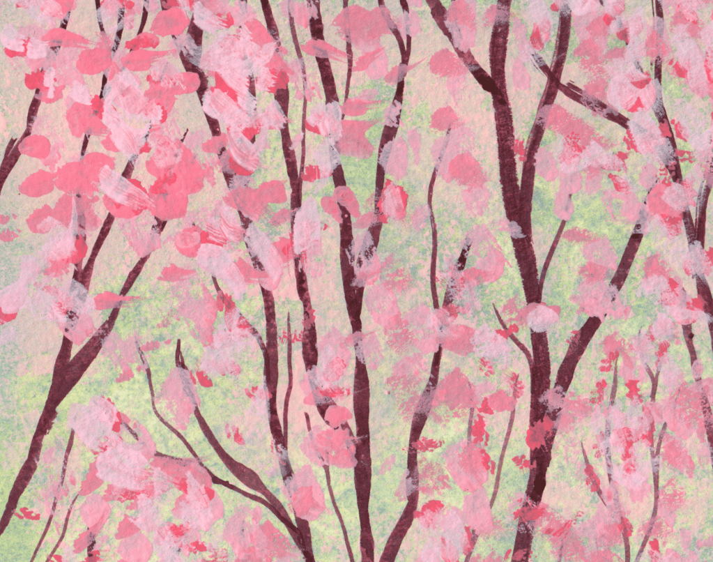
To make the background, I used a sponge to cover the paper in blue-green paint. The branches are painted with a mix of carmine or cool red with black. Once that’s dry, I dotted carmine/white paint to create the cherry blossoms, or sakura, flowers. This gives an abstract effect that looks as if the trees are in motion.
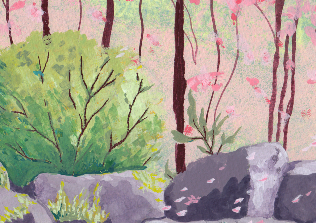
After the background was completed, I blocked in the main shapes with round brushes. Some of the rocks use a wet-in-wet technique, adding different colours before the first has dried, which makes it easier to blend together.
For the branches of the bush and blades of grass, I used a flat brush and ‘stamped’ it on its side, giving a jagged appearance.
A note on colour
I use shade cards I’ve made of different colours, so I can be confident in my choices before adding them. For example, I wasn’t sure if I wanted a pink that leaned warm or cool, but the shade card revealed that the cool-pink was a better match. Generally, I find that if you stick with either a cool palette or a warm palette, and focus on a mixture of dark and light, it tends to work out.
Pushing through obstacles
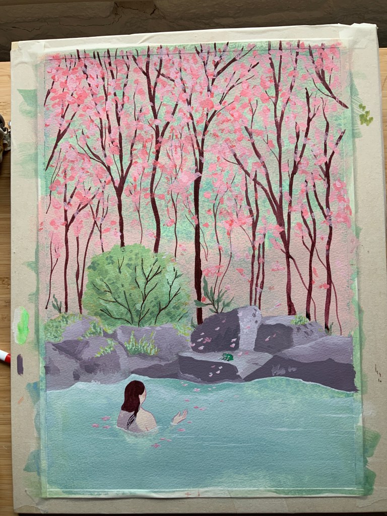
The painting in progress, taped to a wooden board for stability. I was happy with my cool-blue and pink colour palette, but something about it seemed flat. I asked for help in my artist group, and was advised that the rocks could use more definition.
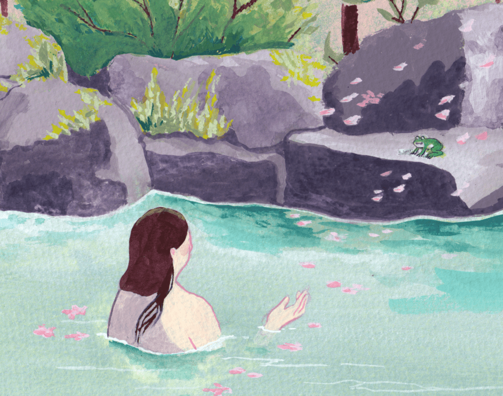
While deepening the shadows of the rocks and making hard edges more obvious, the painting started to make sense, and I added more depth to the bush and water, also. I planned this painting to have the woman as the only character, and added the frog towards the end, changing the painting from depicting a relaxing moment, into storytelling. She is beckoning the frog into the water, a sort of reverse Princess and the Frog story.
At this scale, the frog was difficult to achieve with brushes, so his outline is in a finaliser pen. For the woman’s outline, I used a small round brush. The white reflections in the water are made with a white gel pen.
Framing
One last thing I struggled with was framing the piece. The paper was A3, and I bought an A3 frame to put it in. However, the two sizes were not the same. It turns out that often what is advertised as an A3 frame is a rough guide. A3 is exactly 297mm x 420mm, or 11.7 x 16.5 inches. The frame is around 300mm x 415mm. This meant the painting had a white margin on the sides, but not at the top and bottom.
I solved this by ordering a custom mount, which frames the piece nicely. Lesson learned: paint on larger paper than you need to, think about the final framing before starting, and leave plenty of margin or bleed (extend the edges of the painting beyond what you think you need, but don’t have important information there) and decide on the crop when it comes time to frame it.
The original is for sale, and can be purchased via email, or at Church Lane Gallery in Banbury after 22nd March. There will also be prints available at A5 and A4 from this date.
Please share your thoughts and experiences with similar artistic challenges. I find solving them is much more interesting than giving up and starting again.

Leave a comment